Monday, April 20, 2009

FOCUS: Franchising and Branding- logos


Two of our biggest rivals, the university of florida gators and university of alabama crimson tide, are 2 examples i am choosing to focus on for branding and franchising of the Tailgate. Baton Rouge will be the original location of this bar and restaurant, but it can be re-created in any major college city. school colors and the use of levels and random clocks are the major branding tool for each new tailgate location. special touches from around that school's campus and surrounding community will make each locale different, yet unique to that city. tailgates are all about sports, food, drinking, and fun.. and that is what i hope to achieve with each location.

final logo!! (finally)

more interior

right by waiting area showing entrance into elevator and also back towards the main entrance of restaurant. purple column in far left will be repeated for floor support. these columns are also found flanking tv's in bar.
opposite end of restaurant from mezzanine. shows beginning stages of second level. will have railings for sure! also, at least one staircase for waiters/guests, elevator will bring guests right up to the level. figure shows scale. about 10' from level 2 floor to column capitol.
view of bar looking towards entrance. gives a good view of second level.
original artwork and photography will be found throughout restaurant from and around LSU's campus.
looking up at mezzanine level. large blue screen will be a huge projection screen/tv for sports games. banquette seating in far corner. 4 large tv's line the wall. on floor level, the use of clocks is carried throughout restaurant in tribute to the old clock on the building's exterior.

interior perspectives.. still in the workings

additional view of back of bar near mezzanine level. you can see both levels here that makes it both a standing and sitting bar, with eye level constant across the two.
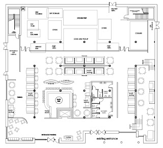
view of bar as soon as you enter. walk through arch and either be seated or walk around to back of bar to stand and place order. restrooms and kitchen located in back. another seating area will be developed in back. first view of second level. i want to hopefully make it see through or a hazy material so that you can't see exactly, but can make out shapes from above.
view looking right as you enter the space. still trying to figure out hostess stand and arch.. bar is in immediate view upon entering, which is seen at left. mezzanine seating up to the right.

exterior perspectives (still in progress somewhat)

menu boards to display that day's selection.
view of entrance. stadium seating acts as benches for waiting. need to work on lighting near doors and to highlight menus.
revised exterior: pushed overhang up to second floor level, moved entrance from corner to a more central position. still have to add in 3rd floor windows.

Sunday, March 15, 2009

Inspiration


inspiration 1: old time sports
inspiration 2: 1950's trucks
inspiration 3: materials

Thursday, February 12, 2009

New Logo Options

below are some different options of logo's i have been struggling with. for some reason, it has taken me way longer then it should to come up with a logo that i like and one that will help to brand my restaurant and give it an identity from those who pass it on the street.

my NEW idea:
since my building is located close to the heart of downtown Baton Rouge, i wanted a place that evokes history and encompasses baton rouge, LSU sports, and the college atmosphere that saturates this area.

therefore, I would like to introduce Baton Rouge TAILGATE, Sports Bar & Bistro. its theme will revolve around history and nostalgia, with a 1950's twist. My final logo below, i feel emulates that. i wanted the word TAILGATE to stand out, since that is the main name of the restaurant, and i wanted it to resemble letters on an old license plate. subtle pinstripes separate the top portion, and then the overall shape is supposed to give a feel of the old chevy and ford truck's emblems. below shows how my design has evolved:


Original Logo Design


this is my original logo from last semester. it was quickly shot down by the faculty, even though i still like it. i knew i needed something better to brand my restaurant, so this is no longer.

Wednesday, January 21, 2009

101 St. Ferdinand Street

the first picture shows a site plan of my restaurant, which is the square corner building in the top left. the others show my building's facade and the infamous clock forever stuck at 10:06. the picture below is the original logo i created this past semester. my idea for this project is a restaurant/bar/banquet space which will be housed in the existing, and abandoned, corner building on St. Ferdinand Street in the downtown area of Baton Rouge. my ideas and name of the restaurant has just recently changed to Baton Rouge Tailgate, but was originally called Concentricity.. which no one liked or could even pronounce, so i knew that had to change.